Pro Motion Physiotherapy
The clinic site and the feed, built as one system.
Client
Pro Motion Physiotherapy
Industry
Healthcare
Year
2025 · Winnipeg, Canada
Services
- Web Design
- Development
- Social Media Management
- Content Strategy
- Booking Integration
[ Overview ]
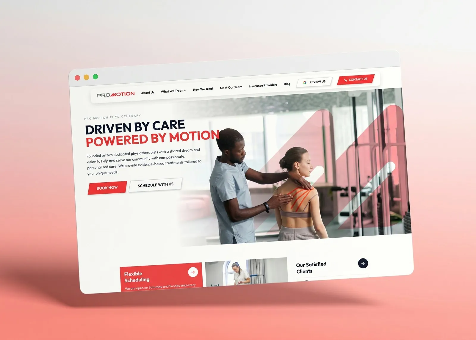
Two physiotherapists opened a clinic with a shared idea of care: evidence-based, personal, and available on weekends. They needed a site that explained what they treat and made booking obvious, and a feed that showed the clinic exists, the care is real, and getting in is easy. We built both as one system, in the same red and white.
[ By the numbers ]
7
Days a week bookable
1
Tap from any page to book
4
Posts a week on Instagram
1
Brand system across site and feed
01
The challenge
Clinic websites tend to bury the one thing a patient in pain wants: a way to get in. Treatments are listed like a menu, the team is a wall of headshots, and the booking link is in the footer. Clinic Instagram accounts default to stock photos and holiday greetings. Nobody follows that.
Pro Motion also had a real differentiator, weekend hours, that was not being said anywhere. Not on the site, not in the feed.
02
The site
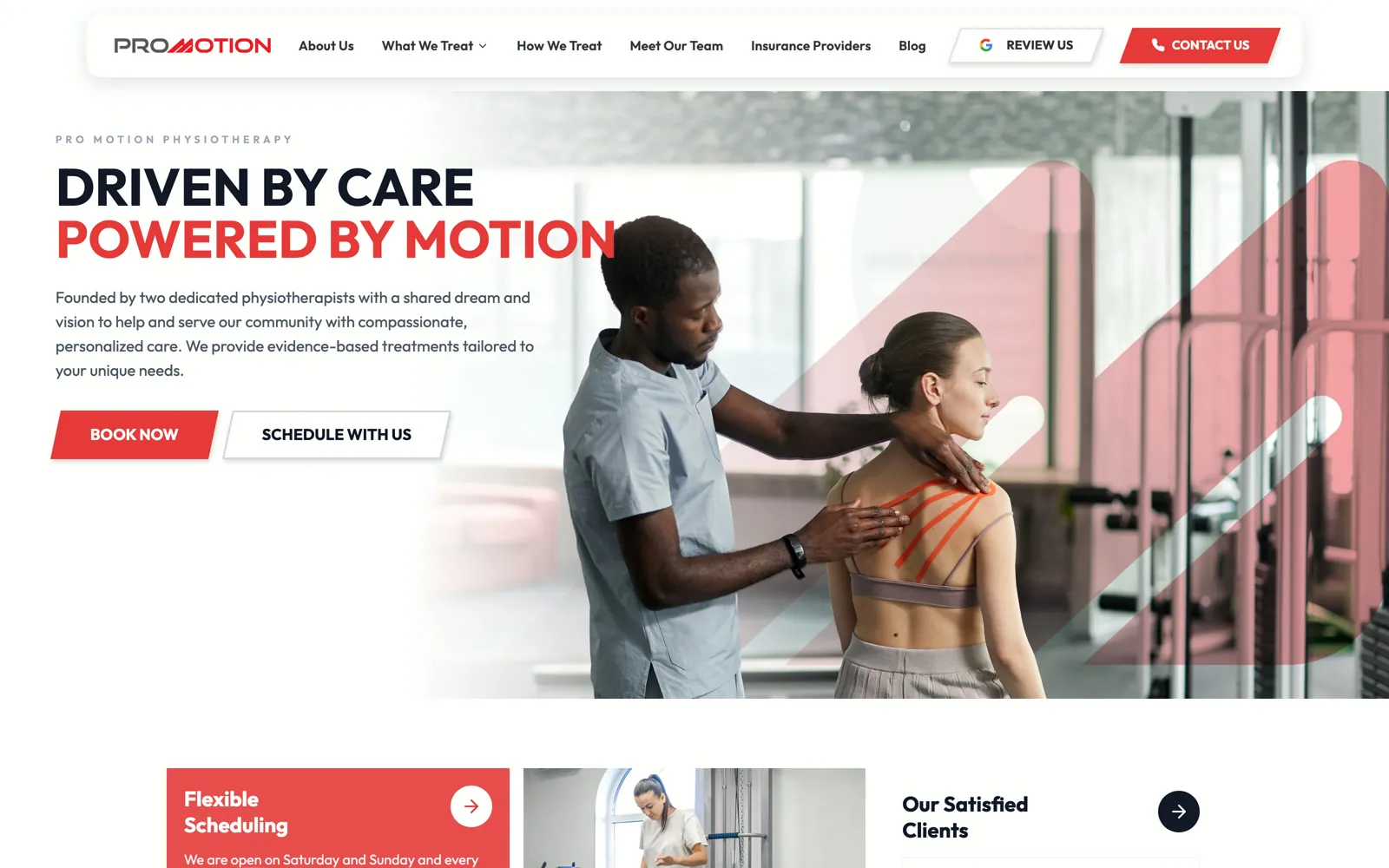
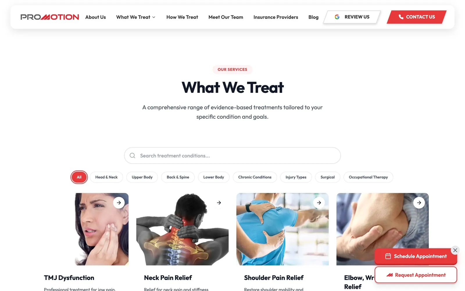
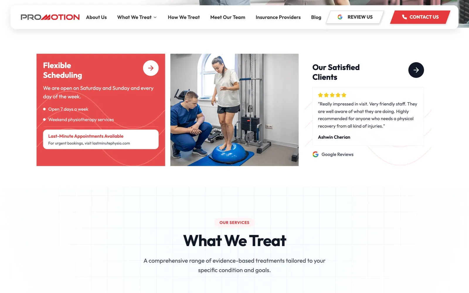
We structured the site around three patient questions: what do you treat, how do you treat it, and can I get in this week. "Driven by care, powered by motion" sets the tone; Book Now and Schedule With Us sit beside it on every page.
A fast, accessible build in the clinic's white and coral, with a treatments library the team can extend, an insurance page that answers the second most common call, and booking handed off to one calendar.
03
The feed
Three pillars: education, myth-busting and clinic life. Bold headlines over real treatment photography, red diagonal accents from the website, and carousels that walk through one fix at a time.
Four posts a week plus stories from the clinic floor. Every post ends the same way the site does: book now, open seven days. The FAQ highlight answers insurance and booking questions so the front desk gets fewer calls.
[ The feed ]
What we publish
@pro.motion.physiotherapyCadence
4 posts / week
Content pillars
- Education
- Myth-busting
- Clinic life
Highlights
- FAQ
- Treatments
- Team
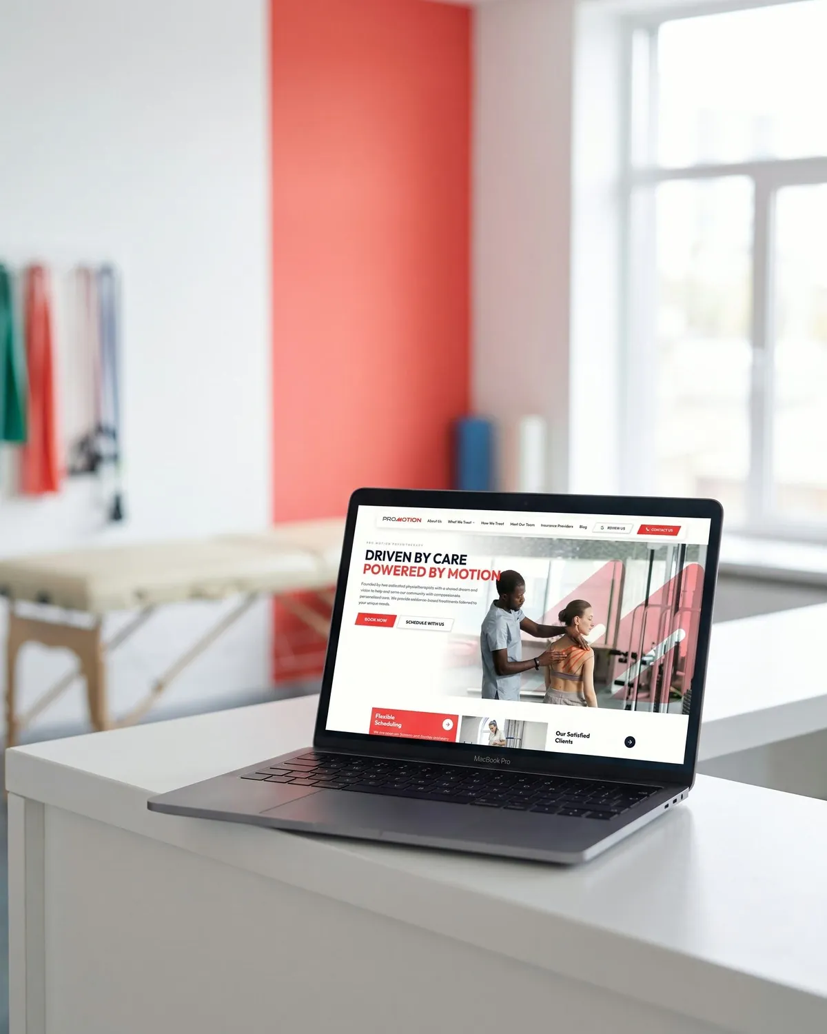
Book from anywhere on the site
Every page ends in the same two actions. Patients do not have to find the booking link; it follows them.
[ Screens ]
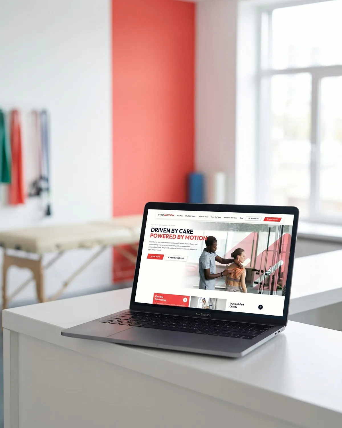
Pro Motion Physiotherapy, page by page
[ Outcome ]
What changed
- 01
Booking is one tap from any page instead of a footer link.
- 02
The website and the feed look like the same clinic.
- 03
Educational posts patients save and share, with every caption pointing to book.
Stack
- Next.js
- React
- TypeScript
- Vercel
- Figma
- CapCut
Deliverables
- Site architecture
- Design
- Development
- Booking integration
- Content pillars
- Post & carousel templates
- Reels edits
- Monthly calendar
[ Next project ]
Keep exploring
HuntsPip
A TradingView indicator library that turned into a subscription business.
Open case study→
[ Your turn ]