Recache
Your daily medication companion.
Client
Recache
Industry
Health & Wellness
Year
2026
Services
- Product Strategy
- UX Architecture
- UI Design
- Design System
- Prototype
[ Overview ]
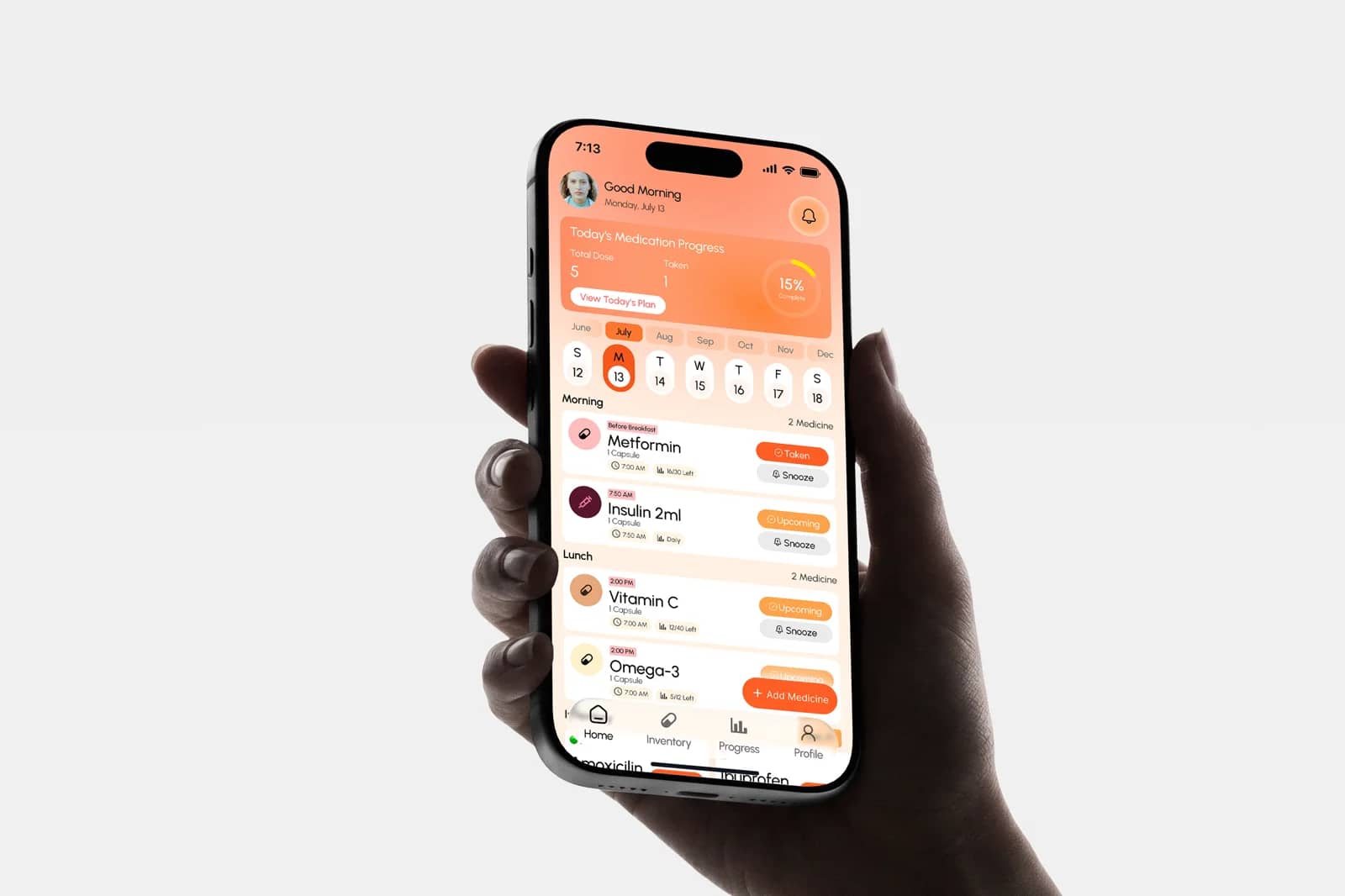
Most medication apps treat adherence as a memory problem and stop at a reminder. The harder part comes after: the box is nearly empty, the refill has not been ordered, the strip in the drawer expired two months ago, and the blood test that explains the dose is in a photo roll somewhere. Recache holds the whole routine — the schedule, the supply behind it, and the paperwork around it — in one warm, unclinical app.
[ By the numbers ]
4
Core surfaces: home, inventory, progress, profile
3
Dose states: taken, upcoming, snoozed
2
Stock warnings: running low and expiring
1
Place for scripts, scans and results
01
The challenge
Someone on five medications is running a small logistics operation. Different times of day, different rules about food, different pack sizes running down at different rates. A reminder that only says "take this now" answers the easiest question and leaves the rest.
The tone mattered as much as the structure. Health tools default to clinical white and alarm red, which makes a daily routine feel like a diagnosis. This had to feel like something you would open at breakfast.
02
The approach
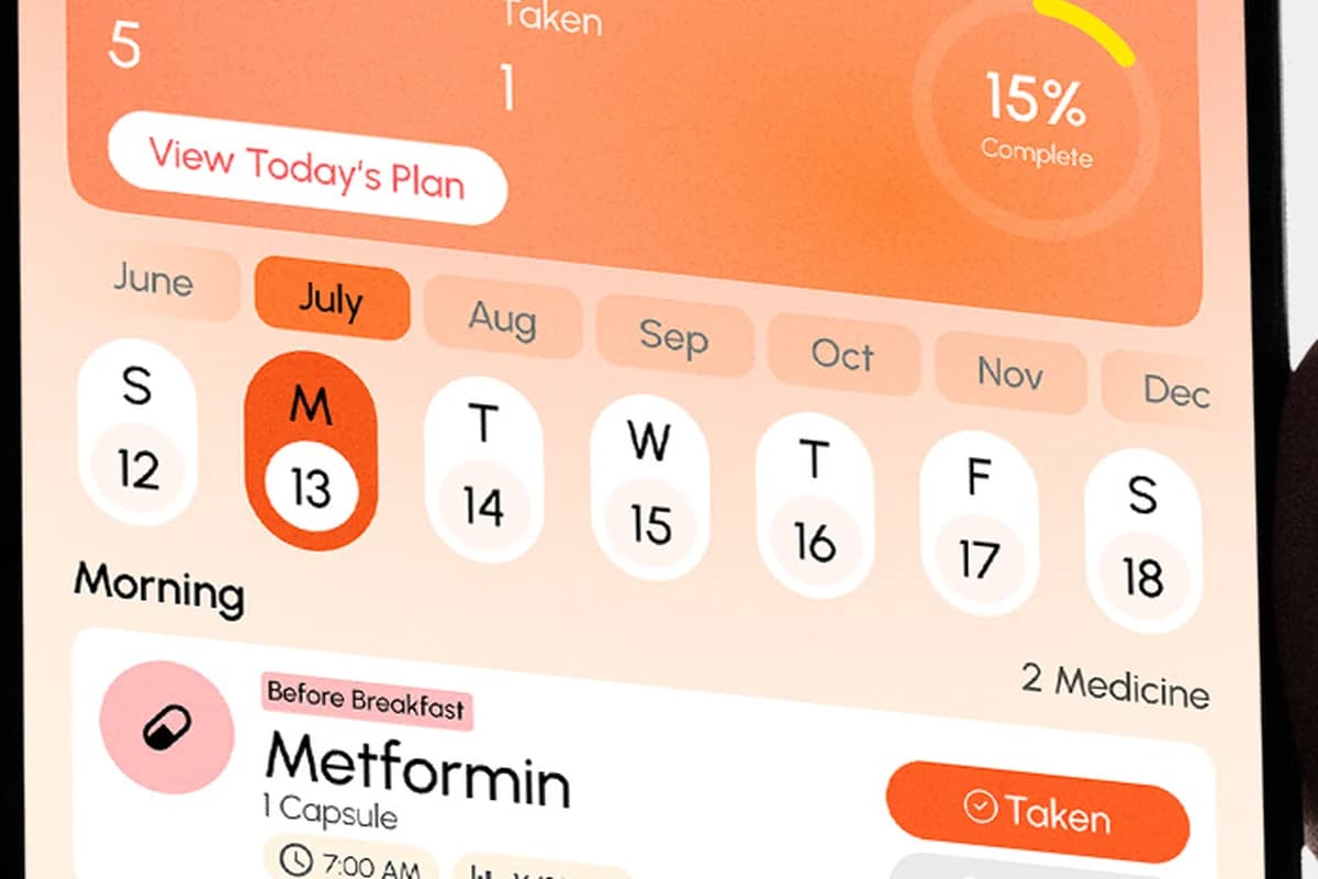
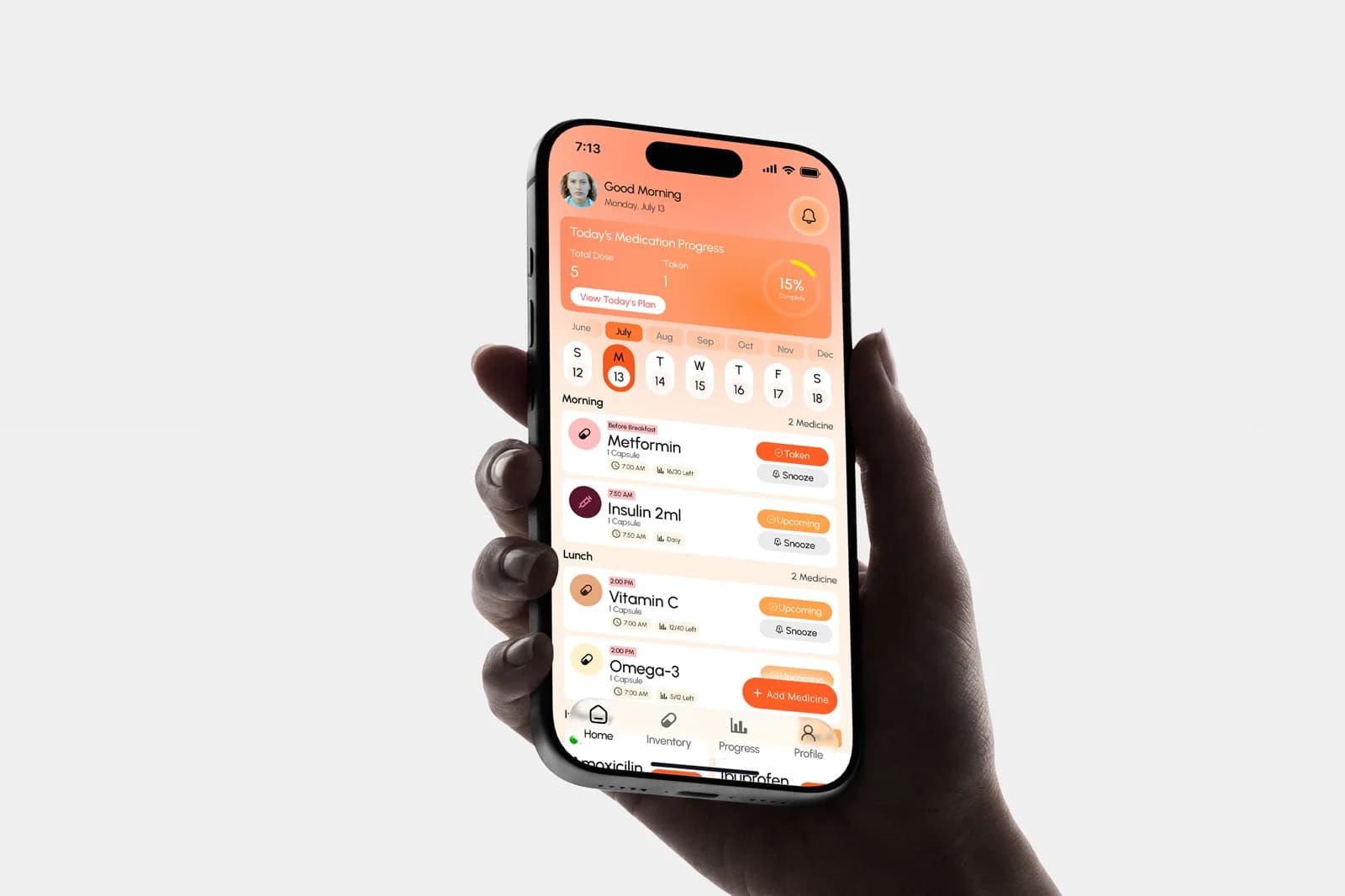
The home screen answers one question before you read anything: how much of today is done. A dose count and a completion ring sit above a calendar strip, then the day breaks into morning, lunch and evening so a schedule is read as a routine rather than a list.
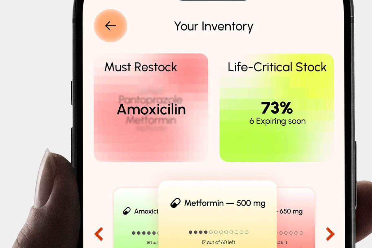
Every dose carries its own state — taken, upcoming, or snoozed — so the screen stays truthful as the day moves. Warm coral and amber carry the whole interface; red is held back for the one thing that genuinely needs it, which is stock about to run out.
03
The system
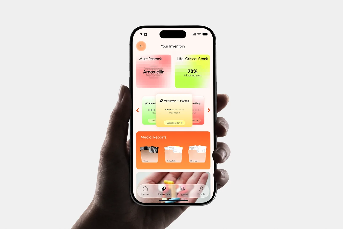
Inventory is the half most apps skip. Recache tracks what is left in each pack, flags what is running low and what is expiring, and keeps a reorder one tap from the warning that raised it. Scripts, x-rays, doctor’s notes and blood tests live in the same place, so an appointment does not start with a search.
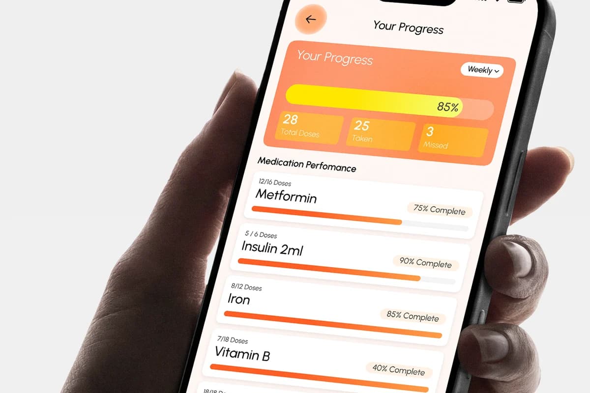
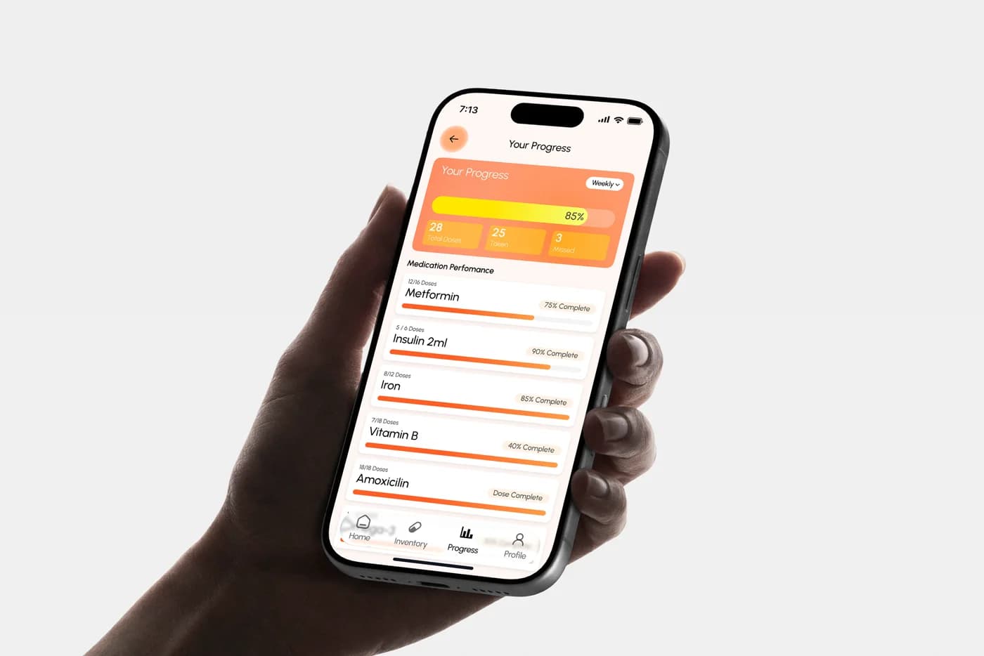
Progress closes the loop weekly: doses taken against doses due, then the same number per medication, because adherence is rarely bad across the board — it is usually one that keeps getting missed.

A brand that does not feel like a pharmacy
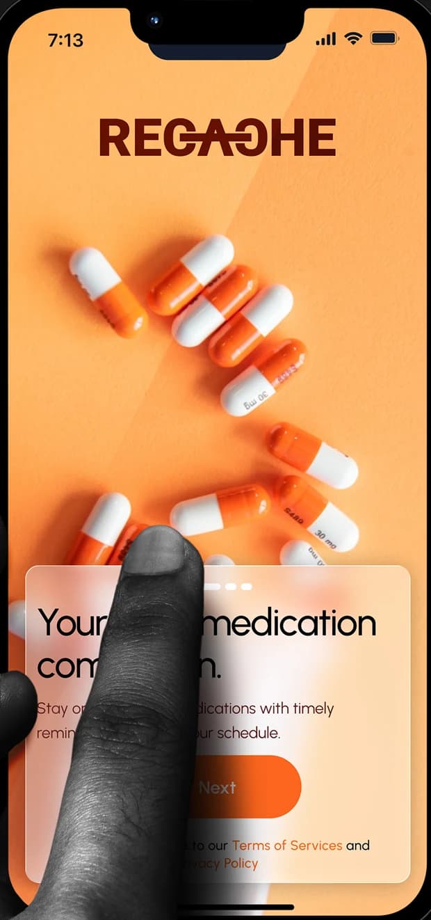
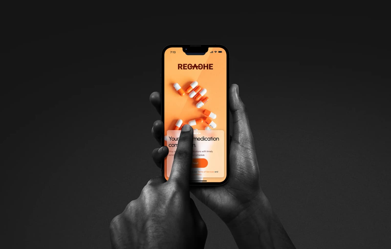
The identity leans on warm coral and a struck-through wordmark, photographed on a dark plate so the product reads as considered rather than clinical. It is the first thing a new user sees, and it sets the expectation that this app is on their side.
[ Screens ]
Recache, page by page

[ Outcome ]
What changed
- 01
The day is answerable at a glance — doses done, doses left, and what is next.
- 02
Running low and expiring are caught before the pack is empty, with reorder attached to the warning.
- 03
Schedule, supply and records sit in one app instead of a reminder, a note and a photo roll.
Deliverables
- Product strategy
- UX architecture
- UI design for four surfaces
- Brand mark & colour system
- Component library
- Interactive prototype
[ Next project ]
Keep exploring
Wealth Flow — Website
For traders, by traders.
Open case study→
[ Your turn ]